Infographic: The world as 100 people

Wednesday, March 27, 2013

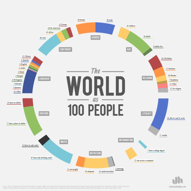
Graphic designer Jack Hagley uses statistics data to create this visual breakdown of the world population by categories such as religion, language, gender, age, literacy, and nutrition.


bigger

Visual.ly | via
Follow Blame it on the Voices on Twitter | Blame it on the Voices on Facebook

If you liked this post, you can subscribe to the Blame It On The Voices RSS feed and get your regular fix


0 comentarii:

Post a Comment

Dear spammers! Please note that a nofollow attribute is automatically added to all the comment-related links!

You can use the following HTML tags: <b>, <i>, <a>