Follow Blame it on the Voices on Twitter | Blame it on the Voices on Facebook
 If you liked this post, you can
subscribe to the Blame It On The Voices RSS feed and get your regular fix
 If you liked this post, you can
subscribe to the Blame It On The Voices RSS feed and get your regular fix
Subscribe to:
Post Comments (Atom)


3 comentarii:
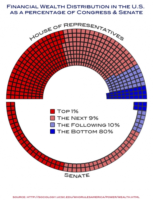
Title should be 'Income Distribution of US House & Senate' (not 'Congress & Senate', also, not 'In the US', because the chart only shows Congress)
There are actually people that think the red squares are the Republicans and the blue squares are the poor old Democrats. The graph certainly isn't labeled that way. I wonder if whoever made it is playing upon the media training of "what those colors mean".
I agree, they should not have used red and blue.